Introduction
A personal portfolio is a small project with a big impact. It needs to load fast, stay easy to update, and present your work, experience, and writing without requiring a heavy runtime. A blog adds another requirement: publishing new articles should be as simple as adding a Markdown file.
This article explains how to build such a site with Astro. The running example is this website, mustapha-zouari.com, a portfolio and blog that combines static pages, structured data, and a content-driven blog.
Why Astro
Astro is a framework designed for content-focused websites. In this project, Astro is configured for static output: pages are rendered to plain HTML at build time, so there is no server needed at runtime and no client-side JavaScript unless you opt in.
For a portfolio this gives three useful properties:
- Fast initial load because the browser receives plain HTML
- Simple deployment because the output is static files
- Low maintenance because the content is mostly Markdown articles and TypeScript data modules, with almost no runtime code
Astro does not force a component framework. You can write components with a template syntax similar to HTML, and add client-side JavaScript where you need interactivity. Astro follows an islands architecture: most of the page remains static HTML, while selected interactive components are hydrated independently in the browser. An island can be built with a framework such as React or Vue without turning the entire site into a single-page application.
How Astro Works
Astro treats the whole site as a build-time pipeline. The source folders feed the build, and the output is a folder of static HTML files.
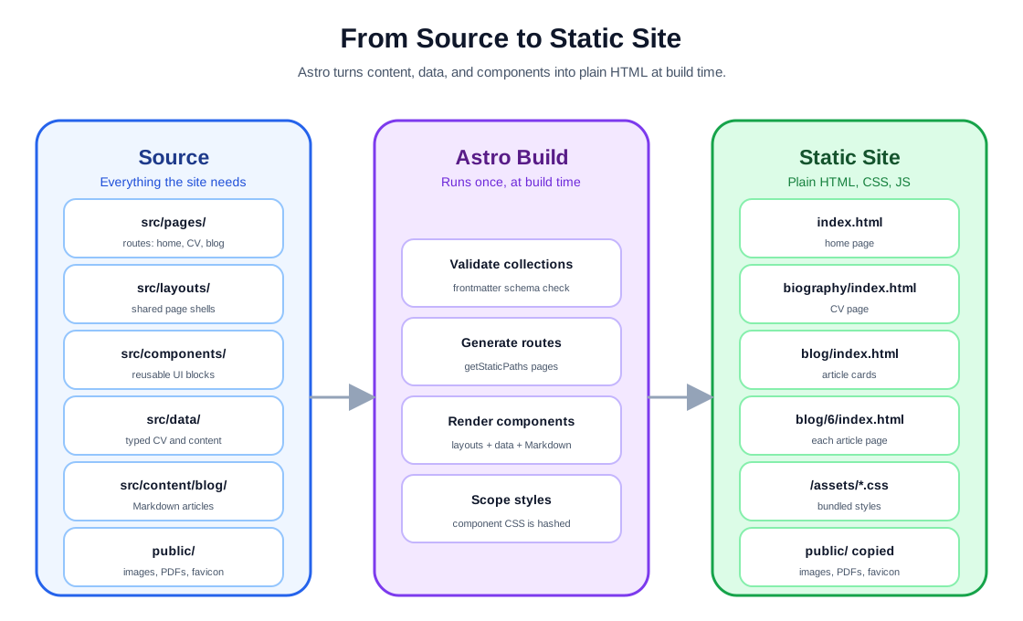
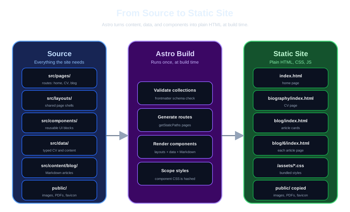
The build does three important things:
- Validate the content collections against their schema
- Generate every route, including dynamic ones built from content
- Render pages to static HTML, with component styles scoped and bundled
Because this project is configured for static output, all of this happens once at build time, so the deployed site has no application server. Every page is plain HTML, CSS, and the minimal JavaScript you explicitly add.
Project Structure
The repository groups files by responsibility:
src/
    pages/
    layouts/
    components/
    content/blog/
    data/
    styles/
public/src/pagescontains route-level pages.src/layoutscontains shared page layouts.src/componentscontains reusable components.src/content/blogcontains the blog articles as Markdown files.src/datacontains typed data objects used by the CV, highlight, preview, and contact views.src/styles/global.csscontains design tokens and shared utilities.publiccontains static assets referenced by URL.
Keeping this separation makes the site predictable. Content lives in Markdown and data modules, presentation lives in components, and routing stays in pages.
Implementation
The code in this section is taken from the actual source of mustapha-zouari.com, so the examples reflect how the site is really built.
Style
The site separates global styles from component styles. Global styles live in src/styles/global.css and apply to every page. Component styles live inside each .astro file and apply only to that component.
Global styles are defined as CSS custom properties, called design tokens. Two blocks define the two themes: :root for light mode and :root.dark for dark mode.
:root {
    --color-primary: #2563eb;
    --color-secondary: #1e293b;
    --color-bg: #ffffff;
    --color-bg-light: #f8fafc;
    --color-border: #e2e8f0;
    --color-text: #1e293b;
    --spacing-lg: 2rem;
    --border-radius: 8px;
    --max-width-content: 900px;
    --transition-speed: 0.3s;
}
Components consume shared design tokens through CSS custom properties for theme-sensitive and reusable values. This keeps colors, spacing, radii, and other shared decisions consistent across components.
The token set mixes primitive values with semantic ones. --color-primary is a primitive palette token; --header-foot-bg and --card-bg are semantic tokens that describe where a component is used. Components read the semantic tokens, so changing a theme is a change to the token definitions, not to component CSS.
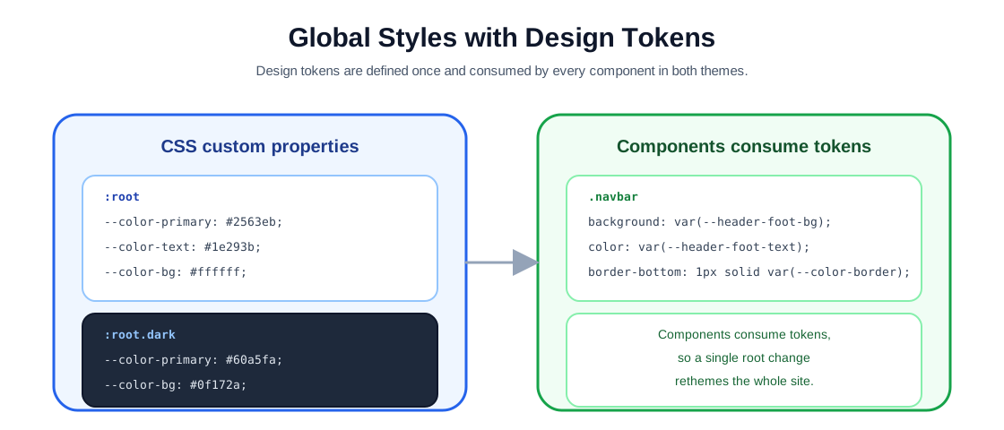
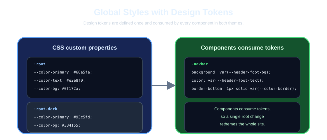
The global stylesheet also exposes small utilities that components reuse: .container, .content-wrapper, .card-section, .card-container, and .card-item. They centralize the maximum widths and the shared card visual.
.container {
    max-width: var(--max-width-container);
    margin: 0 auto;
    padding: 0 var(--spacing-lg);
}
Component styles use the same tokens but stay local. Astro scopes a component’s <style> block to that component by default, which prevents most accidental selector collisions between components.
<style>
    .navbar {
        background-color: var(--header-foot-bg);
        color: var(--header-foot-text);
        padding: 1rem 2rem;
        border-bottom: 1px solid var(--color-border);
        box-shadow: 0 2px 8px var(--color-shadow-lg);
    }
</style>
The block above comes from Navbar.astro and relies on global tokens. How scoping works is covered in detail in the Scoped Styles subsection below.
Component Structure
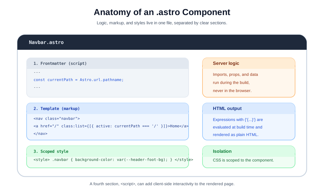
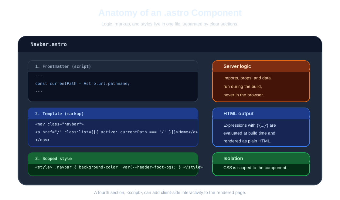
An Astro component is a single .astro file with up to four parts: a frontmatter script, the template, a scoped <style> block, and an optional <script> block for client-side behavior.
Frontmatter: Build-Time Logic
The frontmatter is the part between the --- fences. With this site’s static output, it runs during the build, never in the browser. This is where you import components, receive props, fetch content, and prepare variables.
The following is the frontmatter of BlogCard.astro:
---
import { Icon } from 'astro-icon/components';
import Tag from './Tag.astro';

interface Props {
    title: string;
    description: string;
    tags: string[];
    publishedAt?: Date;
    href?: string;
    locked?: boolean;
}

const { title, description, tags, publishedAt, href, locked = false } = Astro.props as Props;
---
TypeScript is supported directly in frontmatter. The Props interface is checked against every usage of the component at build time, and Astro.props provides the values passed by the parent page.
Template: HTML and Expressions
Below the frontmatter, the template mixes HTML with expressions. Expressions are written in curly braces and are evaluated at build time, so the output is plain HTML.
<a href={href} class="blog-card">
    <div class="blog-card-body">
        <div class="blog-card-copy">
            <h2>{title}</h2>
            <p class="blog-card-description">{description}</p>
        </div>
        <div class="blog-card-footer">
            <div class="blog-card-tags">
                {tags.map((tag) => <Tag name={tag} />)}
            </div>
        </div>
    </div>
</a>
This is the published-card branch of BlogCard.astro. It shows the main features used across the site:
- Render a variable with
{title}. - Map over an array and render a component per item with
tags.map(...). - Pass props to child components with
name={tag}.
Scoped Styles
The <style> block holds CSS for this component only. Astro scopes component styles by default, preventing most accidental selector collisions between components, so you do not need BEM conventions to stay safe.
<style>
    .blog-card {
        display: block;
        border: 1px solid var(--card-border);
        border-radius: var(--border-radius-lg);
        background: var(--card-bg);
        box-shadow: 0 4px 12px var(--card-shadow);
        transition: transform var(--transition-speed) ease;
    }
</style>
The block above comes from BlogCard.astro. It uses only design tokens and applies only to this component, which is why the global tokens from the Style section stay the single source of truth for the design.
Script: Client-Side Behavior
A <script> block is bundled and shipped to the browser only when the component is used. This is how the site adds interactivity without a client-side framework: the mobile menu, the CV tabs, and the article image lightbox are all plain scripts in their layouts and components.
<script>
    const menuToggle = document.querySelector('.menu-toggle');
    const navRight = document.querySelector('.nav-right');

    menuToggle?.addEventListener('click', () => {
        menuToggle.classList.toggle('active');
        navRight?.classList.toggle('active');
    });
</script>
This is the mobile menu script from Navbar.astro. Astro processes these scripts like build-time modules: they are bundled, deduplicated, and served with a hash. You keep normal JavaScript features, TypeScript, and imports, without shipping a framework runtime.
Pages, Layouts, and Components
The site is structured as a hierarchy of pages, layouts, and components. It is easier to read in three separate diagrams: first pages and their layouts, then what a layout composes, and finally how section components read data.
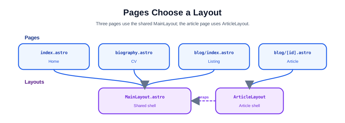
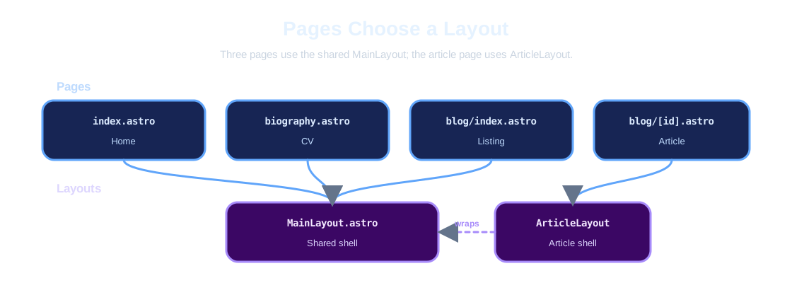
Pages and Layouts
Each page chooses a layout. Three pages use MainLayout, and the article page uses ArticleLayout, which wraps MainLayout.
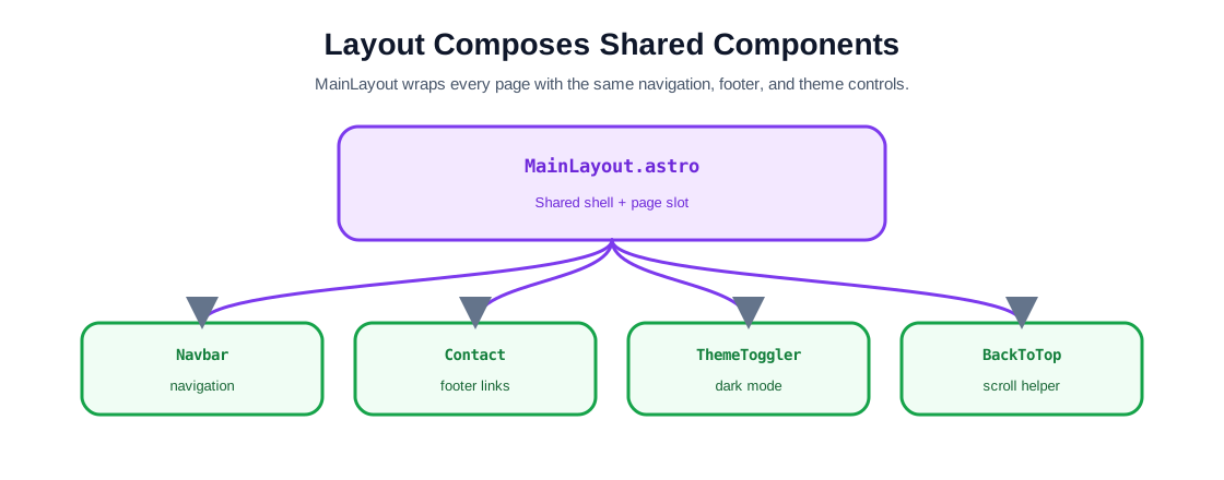
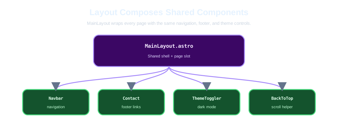
Layout Composes Shared Components
MainLayout composes the components that appear on every page: the navbar, the contact footer, the theme toggle, and the back-to-top button. The page content enters through the slot.
ArticleLayout is an additional wrapper for article pages. It reuses MainLayout and adds the article header, table of contents, tags, and image lightbox.
Section Components Read Data
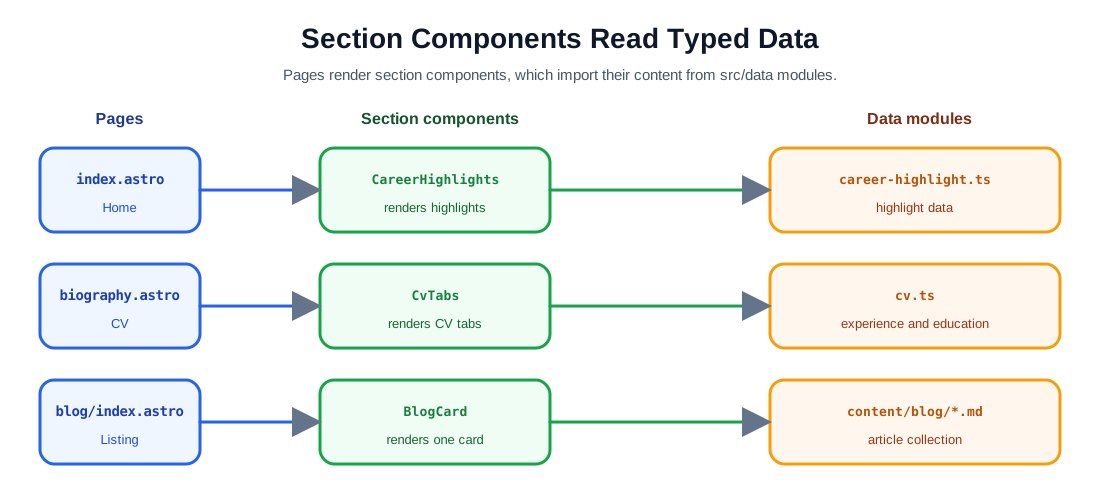
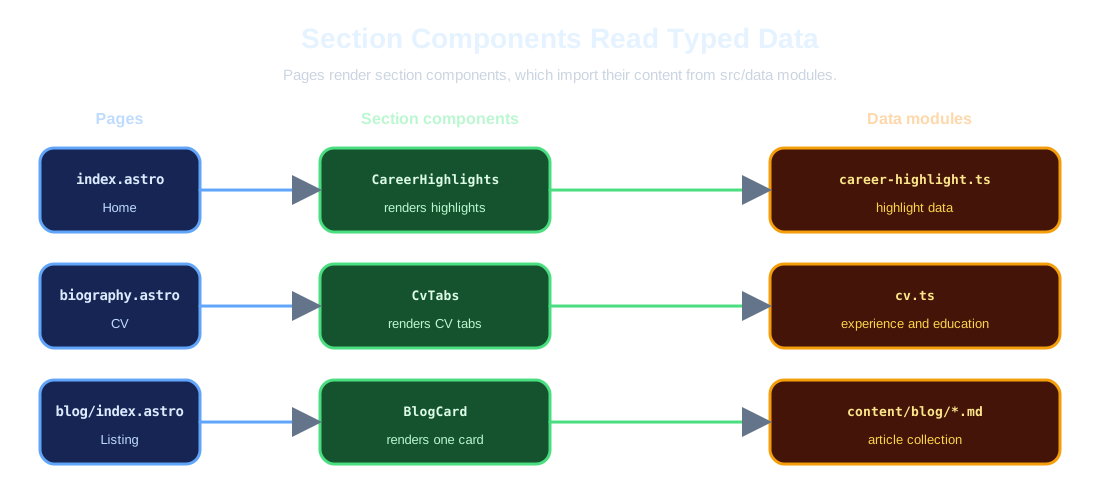
Pages also render section components specific to their content. Each section component imports its content from a typed data module under src/data — or, for the blog listing, from the content collection — instead of embedding it in the template.
The home page is a real example of the pattern. It imports its section components and passes them into the layout slot:
---
import MainLayout from '../layouts/MainLayout.astro';
import CareerHighlights from '../components/CareerHighlights.astro';
import BiographyPreview from '../components/BiographyPreview.astro';
---

<MainLayout
    title="Mustapha Zouari - Software Engineer"
    description="Software engineering insights, tutorials, and articles by Mustapha Zouari"
>
    <section class="home-header hero">
        <h1>Welcome to My Portfolio</h1>
        <p class="subtitle">
            Explore my professional journey and technical expertise as a Software Engineer
        </p>
        <CareerHighlights />
    </section>

    <BiographyPreview />
</MainLayout>
The slot is the content between the opening and closing component tags. The layout wraps it with the navbar, footer, and theme infrastructure, so every page gets the same shell.
Reusable UI pieces are components. Shared components appear on every page through the layout: Navbar, Contact, ThemeToggler, and BackToTop. Section components are page-specific: ProfileImage, CareerHighlights, BiographyPreview, CvTabs, and BlogCard. Components receive props and render Astro markup, which keeps pages short and consistent.
Data-Driven Content
Portfolio content such as professional experience, education, skills, and highlights is structured data reused by several components. Instead of duplicating this information in markup, it lives in typed TypeScript modules under src/data.
For example, cv.ts defines interfaces for a CV and exports the data object:
interface ProfessionalExperience {
    fromYear: string;
    toYear: string;
    title: string;
    team: string;
    enterprise: string;
    icon: string;
    tasks: string[];
    keyWords: string[];
}

export const cvData: CV = {
    proExperienceList: [
        {
            fromYear: '2026',
            toYear: 'Present',
            title: 'System Architect',
            enterprise: 'Dedalus',
            icon: DEDALUS_ICON,
            team: 'Medication Architecture Team',
            tasks: [
                'Contributing to the strategic migration of Medication legacy system to modern microservices architecture',
                'Designed comprehensive migration strategy and secure transition plan to minimize regression risks',
            ],
            keyWords: ['Microservices', 'Legacy Migration', 'Architecture Design'],
        },
    ],
};
Components import the data and render it with expressions. CvTabs.astro maps over cvData.proExperienceList and renders a card per job:
{
    cvData.proExperienceList.map((exp) => (
        <div class="card">
            <div class="card-header">
                <div class="header-top">
                    <div class="header-info">
                        <span class="period">
                            {exp.fromYear} - {exp.toYear}
                        </span>
                        <h3>{exp.title}</h3>
                        <p class="company">
                            {exp.enterprise}, {exp.team}
                        </p>
                    </div>
                </div>
            </div>
            <div class="card-body">
                <ul>
                    {exp.tasks.map((task) => (
                        <li>{task}</li>
                    ))}
                </ul>
                <div class="keywords">
                    {exp.keyWords.map((keyword) => (
                        <span class="keyword">{keyword}</span>
                    ))}
                </div>
            </div>
        </div>
    ))
}
The benefit is separation of concerns. Updating a job entry means editing one data file, not hunting through markup. This separation means content changes do not require editing presentation code. TypeScript interfaces also catch missing fields at build time.
The same pattern is repeated across the data modules: Contact reads contact.ts, CareerHighlights reads career-highlight.ts, and BiographyPreview reads biography-preview.ts. Components never embed the content directly; they import it and render it. This is why the site has a single source of truth for each piece of professional information.
The Blog with Content Collections
The blog is powered by Astro content collections. The schema in src/content.config.ts defines what every article must contain: title, description, tags, publish date, and a numeric id for published posts.
import { defineCollection } from 'astro:content';
import { glob } from 'astro/loaders';
import { z } from 'astro/zod';

const blogCollection = defineCollection({
    loader: glob({ pattern: '**/*.{md,mdx}', base: './src/content/blog' }),
    schema: z
        .object({
            id: z
                .string()
                .regex(/^[1-9]\d*$/, 'Use a positive numeric ID as a string.')
                .optional(),
            title: z.string(),
            description: z.string(),
            tags: z.array(z.string()).default([]),
            publishedAt: z.coerce.date().optional(),
            locked: z.boolean().default(false),
        })
        .superRefine((post, context) => {
            if (!post.locked && !post.id) {
                context.addIssue({
                    code: z.ZodIssueCode.custom,
                    path: ['id'],
                    message: 'Published articles must define a positive numeric ID.',
                });
            }
        }),
});

export const collections = {
    blog: blogCollection,
};
Articles are Markdown files in src/content/blog. This site deliberately uses stable numeric IDs for article URLs (/blog/6) rather than deriving URLs from titles, so changing a title does not change the URL. Published articles use a positive numeric id and locked: false; drafts stay unpublished with locked: true.
The blog index fetches the collection and renders each post as a card:
---
import { getCollection } from 'astro:content';
import MainLayout from '../../layouts/MainLayout.astro';
import BlogCard from '../../components/BlogCard.astro';

const posts = (await getCollection('blog')).sort(
    (a, b) => (b.data.publishedAt?.getTime() ?? 0) - (a.data.publishedAt?.getTime() ?? 0)
);
---

<MainLayout
    title="Mustapha Zouari - Blog"
    description="Articles and insights on software engineering by Mustapha Zouari"
>
    <section class="blog-section">
        <div class="blog-container">
            <div class="blog-grid">
                {
                    posts.map((post) => (
                        <BlogCard
                            title={post.data.title}
                            description={post.data.description}
                            tags={post.data.tags}
                            publishedAt={post.data.publishedAt}
                            href={post.data.id ? `/blog/${post.data.id}` : undefined}
                            locked={post.data.locked}
                        />
                    ))
                }
            </div>
        </div>
    </section>
</MainLayout>
Dynamic Article Pages
Individual article pages are generated from the same collection with a dynamic route: src/pages/blog/[id].astro. The getStaticPaths function tells Astro which pages to build, and the render function returns the article content.
---
import { getCollection, render, type CollectionEntry } from 'astro:content';
import ArticleLayout from '../../layouts/ArticleLayout.astro';

type BlogEntry = CollectionEntry<'blog'>;

export async function getStaticPaths() {
    const posts = await getCollection('blog', ({ data }) => !data.locked && Boolean(data.id));

    return posts.map((post) => ({
        params: { id: post.data.id },
        props: { post },
    }));
}

const { post } = Astro.props as { post: BlogEntry };
const { Content, headings } = await render(post);
---

<ArticleLayout
    title={post.data.title}
    description={post.data.description}
    tags={post.data.tags}
    publishedAt={post.data.publishedAt}
    headings={headings}
>
    <div class="markdown-content">
        <Content />
    </div>
</ArticleLayout>
Content collections validate the frontmatter, so a malformed article fails the build instead of silently breaking the site.
Deployment
Because the build produces static files, deployment is straightforward:
Git repository
    ↓
npm run build
    ↓
Static output in dist/
    ↓
Static hosting and CDN
    ↓
mustapha-zouari.com
A static hosting platform or CDN runs the build and serves the generated dist folder. There is no application server to configure and no runtime to keep updated, so shipping a change means pushing to the repository and letting the platform rebuild.
The main recurring costs of a portfolio are content updates and maintenance. Keeping content in Markdown and data modules, and validation in the content schema, makes both cheap and safe.
Conclusion
Astro is a good fit for a portfolio and blog because it gives you static output, a simple component model, and first-class content collections. The example site shows the pattern in practice:
- Pages and layouts separate routing from shared structure
- Components keep markup reusable
- Design tokens centralize styling and keep light and dark modes consistent
- Data modules keep CV and highlight content maintainable
- Content collections validate and serve the blog
The main lesson is not simply that Astro can build a fast portfolio. It is that a mostly static website can still have a clean application architecture: typed content, reusable components, centralized design decisions, dynamic route generation, and selective client-side interactivity — all without requiring a large JavaScript runtime.